

Website Design : It might be your website, but that doesn't mean it for you.
- Sprung Chicken Design

- Jun 7, 2023
- 3 min read
It's always easier to help with problems in someone else's life, than it is to deal with your own. Well at least that's my excuse for neglecting my own site. Like the proverbial builder's house, after a day of making websites, the last thing I want to do is my own. But when my website just made me sad, it was definitely time for a change.
Web Design choice 1 : Get to the point
Websites have changed over the years, and today it's important to design your website to work on a mobile device. This isn't just about the size of your text and pictures. It's about how people use their phones. Think about how you view a web page on your phone. You choose the page, and finger at the ready, flick up to quickly scan the page. You make the decision on relevance in a split second. You don't want to search through pages of information, you want it there. Your front page should be an advert for the rest of your site.
Web Design choice 2 : My Life Story (It's not all abbot me)
Many of my customers struggle with the idea of an 'about me' page. How to sell yourself to the general public. Here's a hard truth, most of the time no one cares. They want to know what you do, they want to know about your business. Unless you have a life story that's relevant to the web site, don't put it in. All to often an about page can come across more like a teenagers cv (At 8 I did this, then at 12 I did this). When you see the site traffic, and where people click on a website, it's rarely to the 'about' page. People go from the home page to the bit of the site they want. No one shopping on Amazon is clicking around trying to find Jeff Bezo's life story
Web Design choice 3 : A picture is worth 1000 words
We are visual creatures, we like shinny. An image will catch your eye before you've read the text next to it. Good photos and visuals are essential to grabbing peoples attention, and making your site pop. It's always best to get your own pictures taken, but this can be very expensive, especially when you're starting off. Don't be afraid to use stock pictures at first, but don't just pick the most popular. Do you have a friend who always has a digital camera with them? Ask them about taking some pictures. I use students for a lot of my clients. They need the experience and what to expand their portfolios, and they don't want a lot of money. But please, don't just snap 'something' with your phone.
Web Design choice 4 : It might be your website, but that doesn't mean it for you.
And finally to the main point. Your website is not for you. Yes, it has to reflect your business, but it also has to appeal to EVERYONE ELSE IN THE WORLD! When I start working with a client, I ask them to find at least 3 websites that have aspects they like. If there's something on a popular website, it works. There is nothing wrong with taking inspiration from someone else's site.
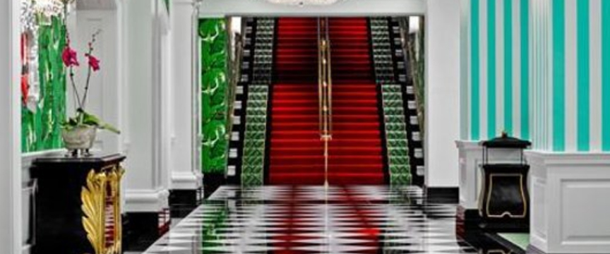
I thought the initial design for my new site was brilliant. Then I showed it to someone else. I still like the design, but after I was told (politely) that it was a little garish, I have to concede the point. You see, I love the fantastic Greenbrier Resort in West Virginia. It's look is part Overlook Hotel, part Laurence Llewellyn Bowles dressing up box, and that astatic had seeped in. But what looks good on the walls and floors of a massive hotel, doesn't work on a mobile phone screen. Use photos and images, use colours and fonts, but be careful not to get carried away.


https://www.wsj.com/articles/design-inspiration-from-dorothy-drapers-greenbrier-resort-1420832365


Comments